
Responsive
UX driven responsive web design. We develop user-friendly and mobile compatible websites for all screen sizes and devices.
Responsive Web Design (RWD) is a key part of our overall SEO strategy. A responsive website will resize itself to the screen size it is being viewed through, allowing the visitor to easily access content via any device. Consequently, a responsive website is more user-friendly, and engaging and creates a long-lasting and positive impression on that site, product, or service.
Because Google highlights a “not mobile friendly” notice in their search results, a none responsive site can be an instant turn-off to viewers. Who then may decide to visit and enquire through a competitor’s website.
. . . . . . . . . .
Outhouse Media design and build beautiful, compatible websites that configure to all desktop, tablet, and iPhone screens seamlessly. We develop, test, and refine each element to ensure a truly fluid quality.
We design & build for all the latest devices including iPhone and iPad.
80%
Of all mobile phone users
Will use their phone to browse the internet, looking for products or services of interest to them. Because unresponsive formats are less user-friendly, they leave a negative impression, which may result in customer loss.
61%
Of visitors to your website
Leave straight away and may think twice before coming back if a website doesn’t suit their sized screen. Studies show that website visitors to none responsive formats and content find them difficult to read, and use and very hard to locate what they are looking for.
66%
Of all online purchases
Or product/service enquiries will be either from a mobile phone or tablet device. For that reason, your business website cannot afford to exclude consumers or their shopping needs.
100%
Increase in accessibility
For responsive website design. Page layouts that adapt to the users’ screen size help to drive more traffic and enquiries. Mobile-friendly websites are also judged more favourably by search engines.

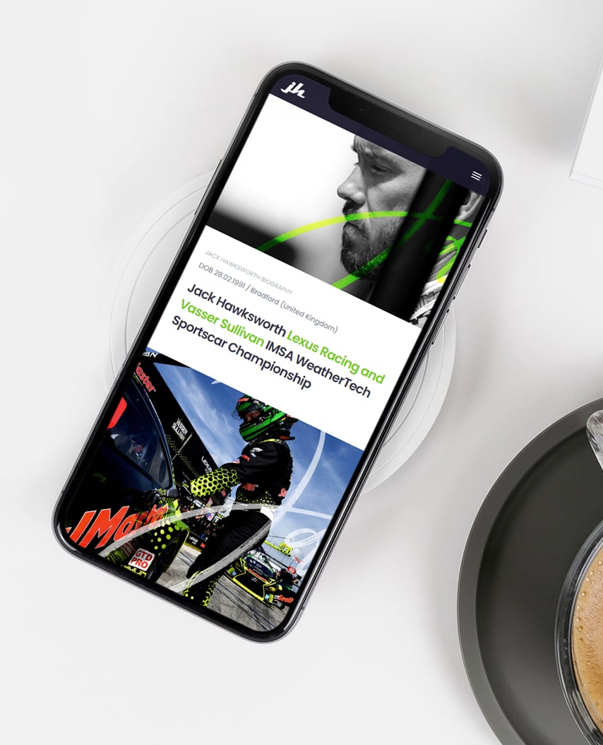
Image shows responsive web design for BGES Group. View project details